
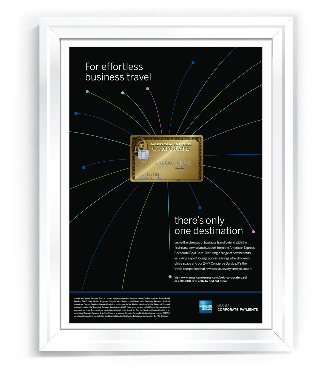
American Express Gold Card - Key Visual
Gold Card
The cachet of a Gold card is not what it used to be, particularly with business travellers.
Therefore, my writer and I positioned it as the best way to remove the stresses of business travel
and make flying an enjoyable experience again. Using the idea of the card being the start and end point of stress-free business travel, we used a flight path style not only as a new brand asset, but as a source of navigation. To reinforce the Amex brand, we chose colours from the ATL brand guidelines and the corporate font.
Direct mail pack
The welcome pack reflects the look and feel of the launch ad and uses the flight lines to lead the eye
to the card when fully opened. The documents are contained within secluded pockets, and the outer
is designed to open effortlessly.
to the card when fully opened. The documents are contained within secluded pockets, and the outer
is designed to open effortlessly.

Video
A 3-minute animated film was produced for the launch event and internal comms describing the benefits as a journey, with the viewer arriving at the card. After launch this film was playing in all head office receptions across the globe
Stills
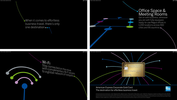
Launch film